The Challenge With Worship Announcements
Have you ever felt frustrated during a worship service when an announcement appears on screen, only to disappear before you can absorb the information? It’s a common issue.
Even more problematic are the ads that are so crowded that anyone sitting beyond the first few rows struggles to make out crucial details. These well-intentioned communication efforts often fail precisely when they’re most needed. Then, leadership wonders why people don’t recall event information even though they’ve seen it multiple times.
Let’s take a look at some best practices for ads in worship.
Crafting Effective Worship Announcements
To transform your worship announcements from sources of frustration into ministry tools, consider implementing these best practices:
1. Prioritize Text Legibility
Make Size A Priority: Text should be a minimum of 36px on a standard 1920×1080 graphic, though 48px or more is preferred for most text. Headlines should be substantially larger (72px+) to establish proper hierarchy.
Which of the following Ads reads better?

Choose Fonts Wisely: Select clean, straightforward fonts that project well. Sans-serif options like Helvetica, Arial, or Roboto often work better in church than decorative or script fonts.
Once again, which ad is easier to read?


Create Strong Contrast: Stay away from colors that are too close together or are too intense. White or very light text on dark backgrounds typically performs best in most sanctuary lighting conditions.
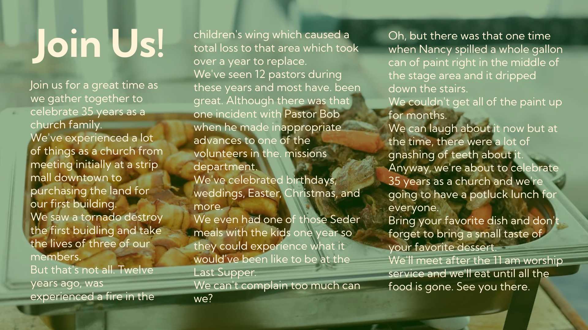
Have you ever seen images with a light blue background and white text? This hurts my eyes just looking at it. What about an ultra purple with pink text? This is really hard to read from a distance. Or this white on beige one, that I’ve seen used in the past. Yes, there is text on that graphic. What about an ultra purple with pink text? This is really hard to read from a distance. Or this white on beige one that I’ve seen used in the past.
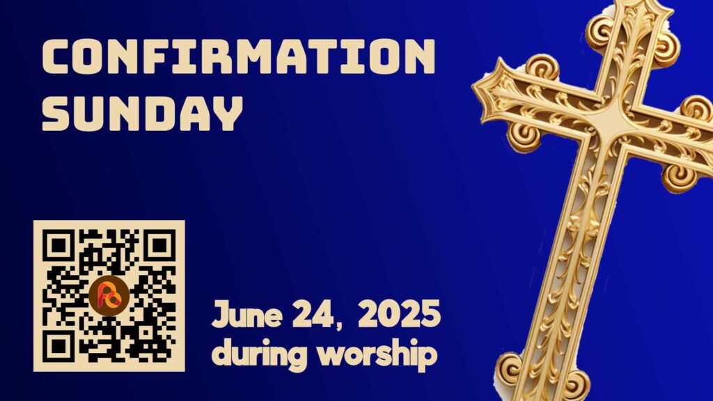
Look at the difference between these next two images.
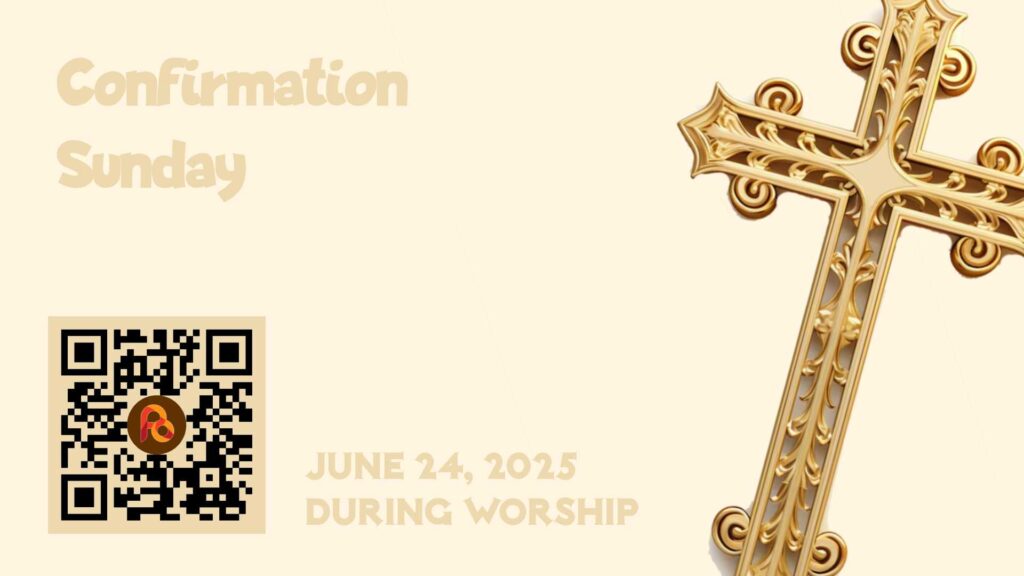
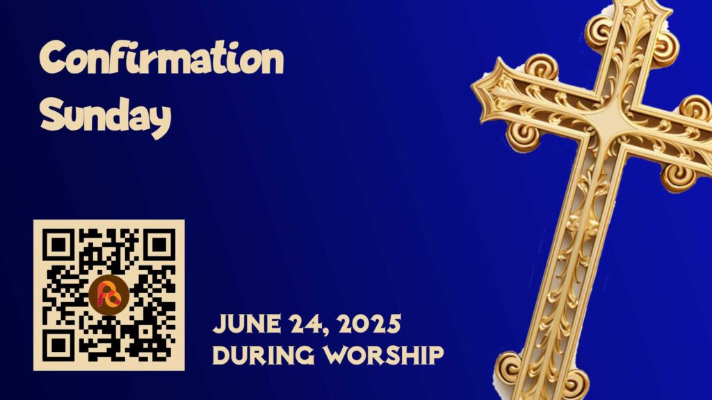
High Contrast works best for everyone. White on a dark blue background and similar arrangements are easy on the eyes. The higher the contrast, the better.


Here’s an example of an ad I found at a church recently. You tell me if you could read all of it from the back row of your sanctuary.
2. Embrace Information Hierarchy
Focus on essential details: Each announcement slide should communicate only the core information: event name, date/time, location, and one clear call-to-action.
It doesn’t need all the information about the event.
Practice ruthless editing: Ask yourself, “What does the congregation need to know right now?”
Use visual hierarchy: Make the most important information (usually the event name) the largest and most prominent element, with supporting details presented in descending order of importance, smaller. The exception might be a QR Code, which needs to be large enough for people to scan from a distance.
3. Incorporate Digital Engagement Elements
Leverage QR codes strategically: Include a large QR code that links directly to event registration or detailed information pages. Position it in a consistent location on all announcement slides. This is a great use of your events page or calendar.
Make QR codes actionable: Add a brief instruction like: Scan For Details, or Scan To Register, to encourage interaction.
Test QR functionality: Ensure your QR codes are sized appropriately and have been tested from various distances in your actual worship space. There’s nothing worse than a link that takes people to a 404 page.
4. Adopt Minimalist Design Principles
Embrace white space: Allow for generous margins and spacing between elements to improve readability and focus.

Choose imagery selectively: Use relevant, high-quality images that enhance rather than compete with your message. Sometimes, a solid color background is more effective than a busy photo.

Create consistent templates: Develop a system of 2-3 announcement templates that maintain your church’s visual identity while simplifying the creation process for staff or volunteers. You can even set up templates for specific types of events. For instance, have one template for youth, another for adults, and still another for missions.
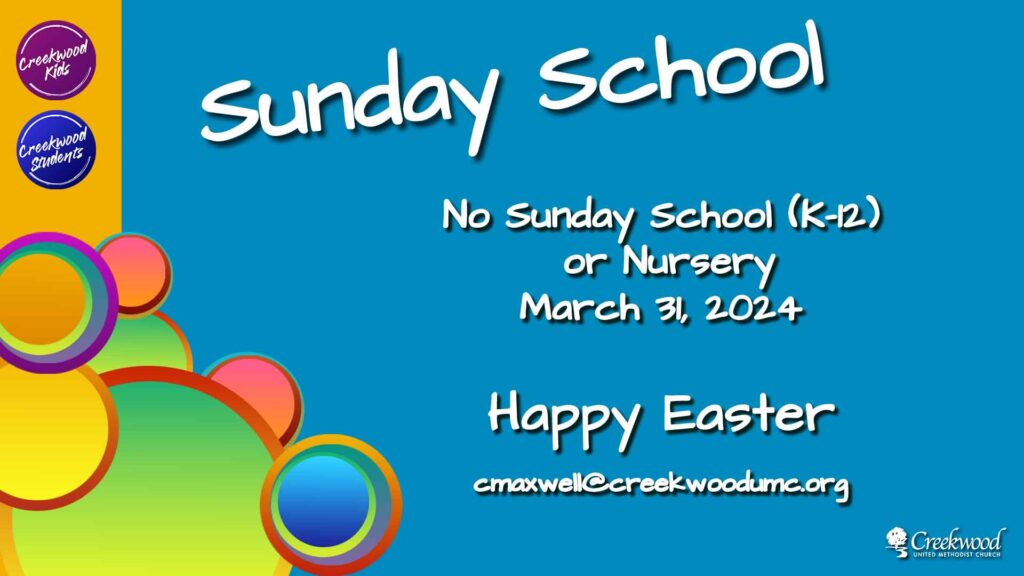
This was the template I used for children’s ministry announcements. The colorful bubbles and logos remained. Just the text changed depending on the occasion for students and children.
5. Perfect Your Presentation Timing
Allow adequate viewing time: Display each announcement for 10-20 seconds, longer for complex information or if you serve an older congregation. But we’re not going to do that, right? Our focus will be on simple messages with the details on the website. Personally, I’ve experimented with this and find 8 seconds to be a pretty good compromise. However, some of this depends on how much is on the slide.
Consider announcement loops: Before and after services, run a continuous loop of announcements to maximize exposure without rushing through important details. This is simple when done in ProPresenter. In my case, I also had a TV in the lobby that displayed the ad deck throughout the week. It was usually updated on Tuesdays.Coordinate verbal reinforcement: Stage announcements should affect nearly the entire congregation. Use the pastor as the sounding board for these announcements. When the pastor speaks, people listen. We don’t recommend that the pastor announce events for smaller ministries. If they start announcing everything, people will treat all announcements as unimportant.
Implementing These Practices
By thoughtfully applying these principles to your worship announcements, you’ll create a more effective and consistent communication system that respects your congregation’s attention and delivers information in a way they can use.
Remember that the goal isn’t just to share information, it’s to inspire participation and build community. Well-designed announcement slides are ministry tools that can help transform mere attendees into engaged participants in your church’s mission.
When your announcement slides follow these best practices, you’ll minimize confusion and boost participation in church events. Your congregation will better understand and respond to the information you’re sharing.
Do you need help creating graphics or training others for your church communications? Professional guidance can transform your worship announcements into powerful tools for ministry connection and growth.
Want a consultation? Click the link below.

Love you my sweet! You are doing a great Job!